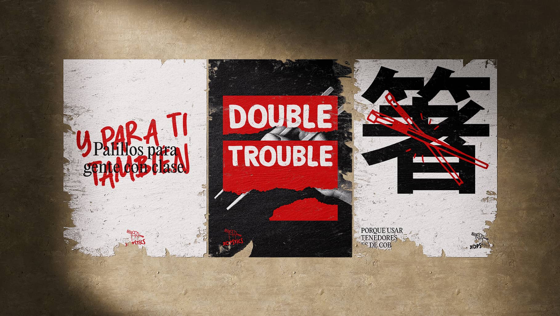
→ The chopsticks guy
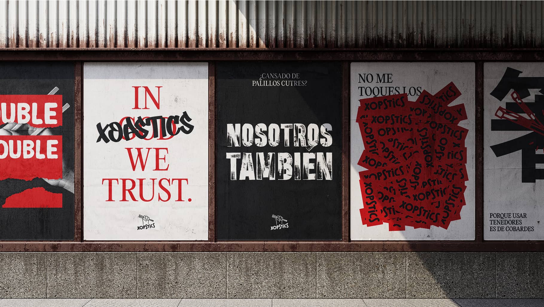
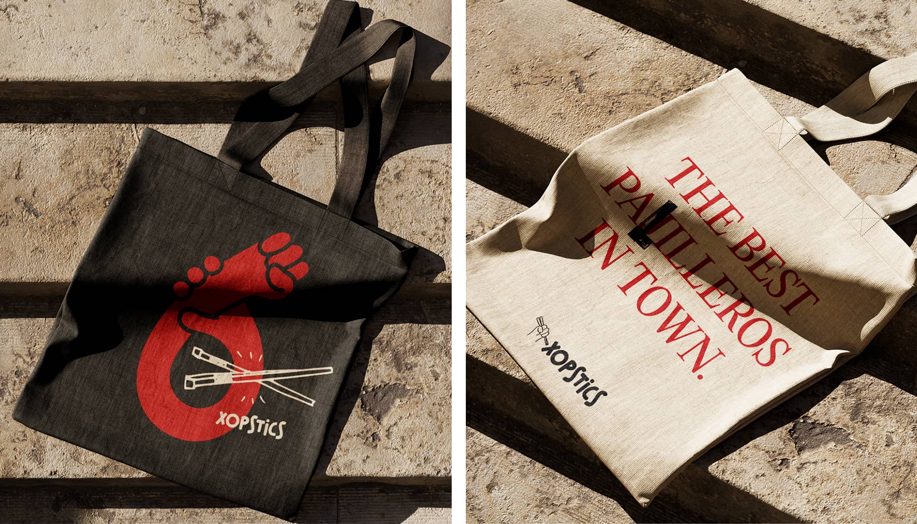
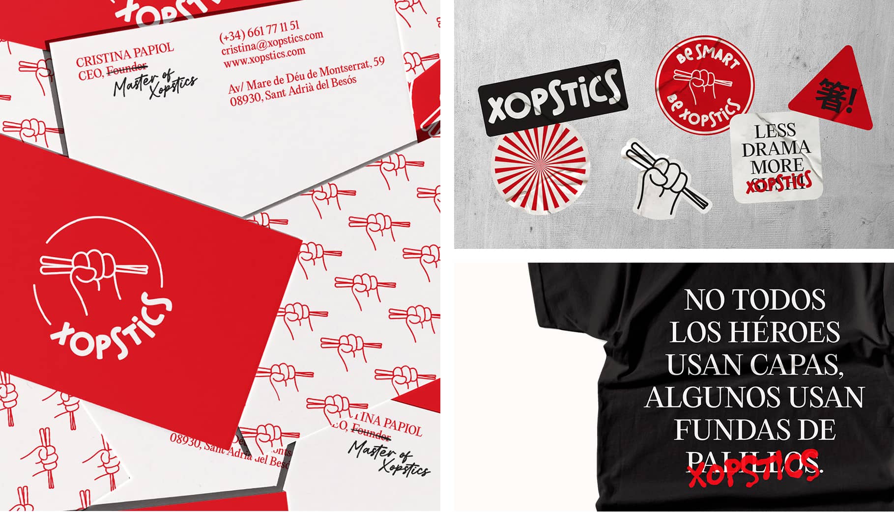
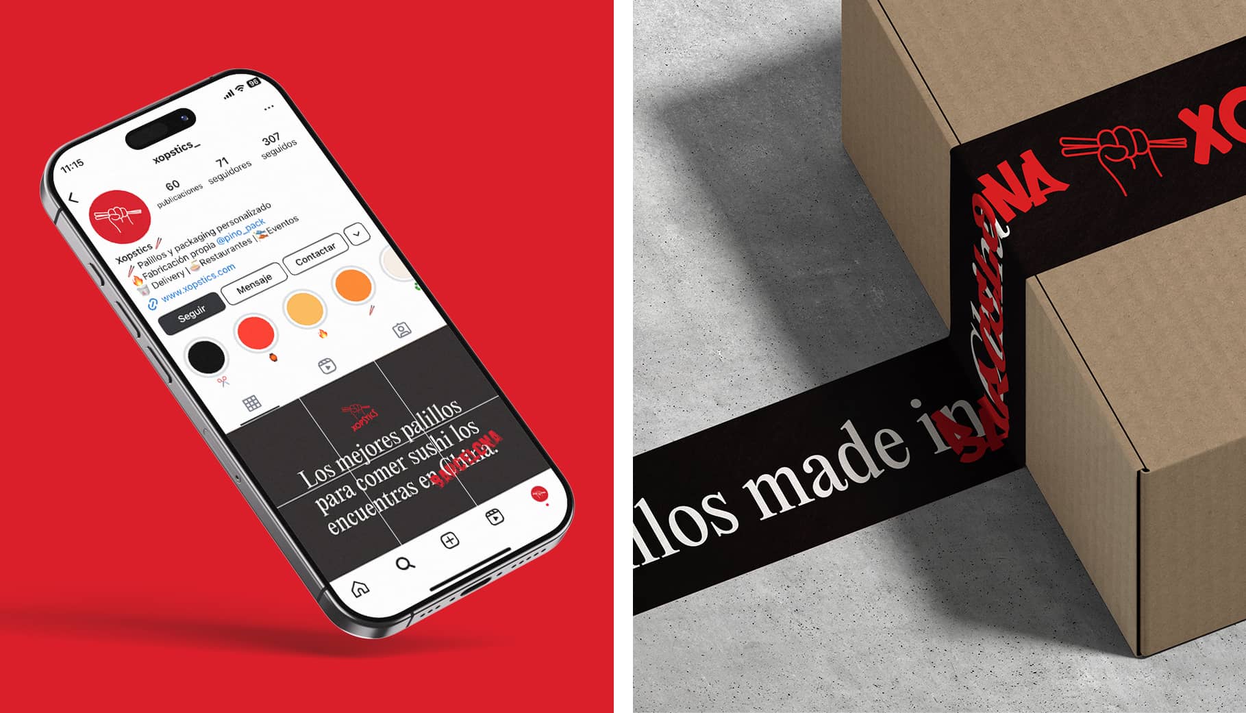
The client was clear about one thing: he wanted to be known as “the chopsticks guy". And he wanted a bold, playful identity that stood out from the norm in the industry — with strong influences from Asian graphic design. We developed a brand identity with a rebellious spirit, almost like a protest. An identity that portrays the uprising of chopsticks defending their place in Asian cuisine. Contrasting colors, overlapping handwritten texts, crossed-out words, torn paper, and street-style language are all distinctive elements of the brand.


